
Looking For Tops And Bottoms, The Stanley Druckenmiller Way (The Cestrian Circle Newsletter)
DISCLAIMER: This note is intended for US recipients only and, in particular, is not directed at, nor intended to be relied upon by any UK recipients. Any information or analysis in this note is not an offer to sell or the solicitation of an offer to buy any securities. Nothing in this note is intended to be investment advice and nor should it be relied upon to make investment decisions. Read our full disclaimer, here.
Origination and Prompts by Alex King, CEO, Cestrian Capital Research, Inc; Indicator Creation and Article Detail by Claude CoWork.
Background
Stanley Druckenmiller — who has reportedly compounded capital at roughly 30% per annum for three decades at Duquesne Capital and as lead portfolio manager of George Soros's Quantum Fund — is not a man who talks about his process in any great detail. But in a handful of interviews over the years, one methodological disclosure surfaces repeatedly: he relies heavily on charts built around the second derivative of price change, and has done so since early in his career. He has said, specifically, that these charts "often bottom a year to a year and a half before the fundamentals" — and that his typical workflow is to observe a signal in the chart first, then go looking for the fundamental thesis to support it.
Now this is pretty interesting to me, because if it could be codified with even a modicum of predictive power, it would help identify topping- and bottoming-formations in liquid stocks and ETFs.
Wyckoff Rotation
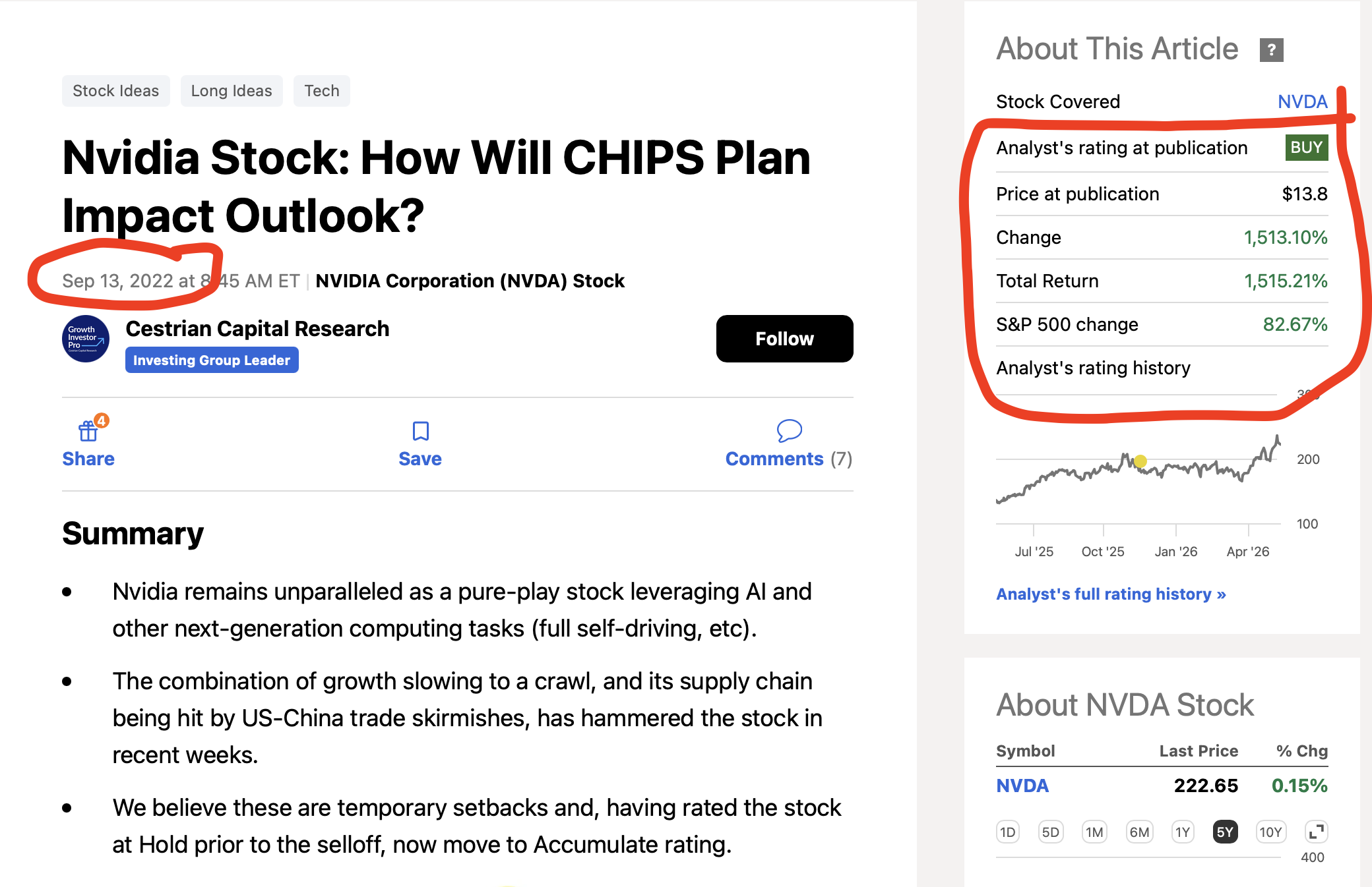
Today at Cestrian we do this at present using a form of Wyckoff Rotation analysis, which in essence means: if we see a stock or ETF trending sideways at the lows, with high volume on the vol x price indicator, we consider it a likely bottoming formation. Using the price range defined by the volume profile we typically use this formation to identify our ‘accumulation zones’. This is by no means a perfect method but it has enabled us to spot names like $NVDA in the range of $10-15/share (split adjusted - it was $100-150 pre split) in late 2022.
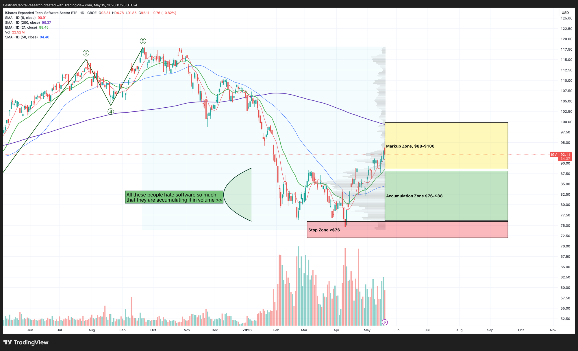
More recently, the same method helped us identify $IGV as an accumulation opportunity between $76-$88/share.
I wanted to see if we could develop methods based on the Druckenmiller approach to add some depth to this toolkit.
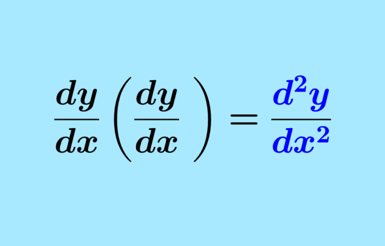
What Is A Second Derivative Price Indicator?
In calculus as you know, the first derivative of a function measures its rate of change. The second derivative measures the rate of change of that rate of change — in other words, acceleration or deceleration. Applied to price, the first derivative asks: how fast is this stock moving? The second derivative asks something more subtle: is that speed increasing or decreasing?
This is a materially different question from what most standard indicators are asking. MACD measures the spread between two moving averages — a smoothed first-derivative proxy. RSI measures the ratio of average gains to average losses over a lookback period — also a first-derivative construct. Neither directly captures whether momentum is building or exhausting. The second derivative does. A stock can be rising steadily and look fine on MACD and RSI while its second-derivative ROC is quietly rolling over — an early warning that the energy behind the move is fading before price itself reflects it.
The indicator described in this note — the Cestrian 2nd Derivative Druckenmiller Indicator, which we will include in selected stock chart analysis going forward — is our implementation of this concept. It is not Druckenmiller's proprietary system, which he has never published. It is Cestrian's reasonable interpretation of the publicly disclosed framework, built with transparent assumptions that we describe and critique below.
How to Interpret the Indicator
The indicator plots as a histogram below the price chart. The zero line is the critical reference point. Above zero means the rate of price change (ROC) is currently higher than it was roc_length bars ago — i.e., momentum is accelerating. Below zero means the ROC has decelerated relative to its prior reading — momentum is fading. The direction of the histogram bars within each zone tells you whether that condition is intensifying or reversing.
Four visual states are encoded in the color scheme:
Bright green (above zero, rising): Momentum is positive and strengthening. The trend has genuine energy behind it. This is not a topping signal — it is a confirmation that buyers are in control and pressing their advantage.
Faded green (above zero, falling): Momentum remains positive but is decelerating. Price may still be rising. This is the first warning that the move is tiring. This as a zone to begin tightening risk rather than adding to positions.
Faded red (below zero, rising): Momentum is still negative — price is still underperforming its prior trend — but the rate of deterioration is slowing. Selling pressure is drying up. This is the most actionable early signal for a potential bottom, and the state Druckenmiller specifically identifies as leading fundamental recovery by months on longer-timeframe charts. By ‘actionable’ I most certainly do not mean “load the Super Duty with short-dated calls”. I mean “consider building a long term position using the common stock”.
Bright red (below zero, falling): Momentum is negative and deteriorating further. A downtrend is accelerating. Not a level at which to begin building positions.
Zero-line crossings are marked with small triangles and represent a discrete phase change — the point at which the second derivative transitions from one regime to another. A cross above zero means the deceleration has reversed into acceleration; a cross below means the reverse. These are meaningful inflection points but should not be treated as standalone entry or exit triggers.
The orange background shading highlights bars in the faded-green state (potential topping zone); the teal background highlights bars in the faded-red state (potential bottoming zone). These background colors exist purely to draw the eye to the two most actionable phases.
The Divergence Labels
The DIV↑ and DIV↓ labels mark divergence — the setup that Druckenmiller himself has described as the most powerful signal the second-derivative framework produces.
DIV↑ (Bullish Divergence): Price prints a new low within the lookback window, but the second-derivative ROC does not confirm with a new low of its own. The indicator's trough is higher than its prior trough even as price moves lower. The interpretation is that selling pressure is exhausting faster than price movement suggests — sellers are still winning the battle but losing the war. Historically on weekly charts this has often preceded meaningful rallies by several weeks to months.
DIV↓ (Bearish Divergence): Price prints a new high within the lookback window, but the second-derivative ROC's peak is lower than its prior peak. Buyers are still winning on price but decelerating in their conviction. This is a warning that the uptrend is running on fumes.
An important operational note: divergence signals are early warnings, not entry triggers. In a strongly trending market, bearish divergence can persist for many bars before price reverses — a stock can make multiple successive new highs while the indicator continues to post lower highs. The DIV label is best used as a prompt to sharpen scrutiny of the fundamental and technical picture rather than as a mechanical trade signal.
Indicator Construction
The mathematics are straightforward. For a given bar, the first-derivative ROC is computed as:
ROC₁ = (Close − Close[n]) / Close[n] × 100
where n is the user-defined ROC length (default: 21 bars). This gives the percentage price change over the lookback period.
The second derivative is then:
ROC₂ = ROC₁ − ROC₁[n]
That is, how much has the rate of change itself changed over the same lookback period. A positive value means the stock is moving faster now than it was n bars ago. A negative value means it is moving more slowly (or falling where it was rising). The raw ROC₂ series is then smoothed with a short EMA (default: 3 periods) to reduce bar-to-bar noise, and a signal line (EMA of 9 applied to the smoothed ROC₂) is overlaid, analogous to the signal line in a MACD.
Divergence detection uses a simple lookback scan: the indicator checks whether the current bar's price is at its highest or lowest point over the prior div_lookback bars (default: 20), and whether the indicator simultaneously is or is not at a corresponding extreme. The logic is coarse — it does not identify confirmed pivot points — but it surfaces the most obvious divergence conditions without requiring additional computation.
A small status table in the top-right corner of the pane displays current phase, the raw indicator value, the signal line value, the underlying first-derivative ROC reading, and the active length setting, providing a quick-reference summary at the current bar.
Shortcomings
We believe in being direct about what an indicator cannot do, particularly for a sophisticated audience who will want to understand the failure modes before relying on it. This is the first incarnation of our indicator and we have to test it in live trading to see how it does. We’ll refer to it in our analysis where appropriate, show it in our charts where useful, and see how it goes.
The parameters are not derived from Druckenmiller's actual system. He has never disclosed his lookback lengths, smoothing methodology, or any other implementation detail. The defaults in this indicator — 21-bar ROC, 3-period smoothing, 9-period signal — are reasonable conventions borrowed partly from existing technical analysis practice and partly from our own judgment. There is no reason to believe they match what Druckenmiller uses, and different parameter combinations will produce materially different signals on the same price series. Users should treat the defaults as a starting point and calibrate to the specific instruments and timeframes they follow.
Both derivatives use the same lookback length. We compute ROC₂ as ROC₁ minus ROC₁ shifted back by n bars, where n is the same for both. There is no particular mathematical reason the two derivatives should share a period. Using a shorter period for the second derivative would make it more reactive; a longer period would smooth it further. We chose symmetric periods for simplicity and transparency, but this is an assumption that can and should be challenged.
The divergence detection is primitive. Our implementation checks whether current price is at a recent extreme while the indicator is not. It does not identify confirmed swing pivots — it simply compares current values against a rolling window. This means the DIV label can fire multiple times during a single divergence setup as successive bars each satisfy the lookback condition. A more rigorous implementation would require confirmed pivot identification, which adds code complexity and introduces its own lookback lag. Users should treat the DIV label as a directional observation rather than a precise signal.
The indicator is noisier on shorter timeframes. The second derivative amplifies the noise already present in price data, because you are differencing a series (ROC₁) that is itself already noisy. On timeframes below daily, the signal degrades rapidly. Druckenmiller's disclosed usage is explicitly on weekly and monthly charts for major macro turning points. Using this indicator on intraday charts will produce a large number of false signals and is not recommended.
Deceleration does not guarantee reversal. A stock can enter the faded-green (decelerating up) zone and stay there for many bars while continuing to rise, simply at a slower pace. The indicator tells you that the rate of change is changing — it does not tell you when price will actually turn. This is the fundamental limitation of second-derivative analysis: it measures the internal condition of a move, but markets can sustain conditions that look exhausted far longer than seems rational.
It is not a complete system. No indicator is. The second-derivative framework is most powerful when used as one layer in a broader analytical process — macro context, fundamental thesis, valuation, price structure — rather than as a standalone signal generator. Druckenmiller himself has been explicit on this: the chart gives him the initial idea, not the conviction. The conviction comes from the work that follows.
Illustrative Examples
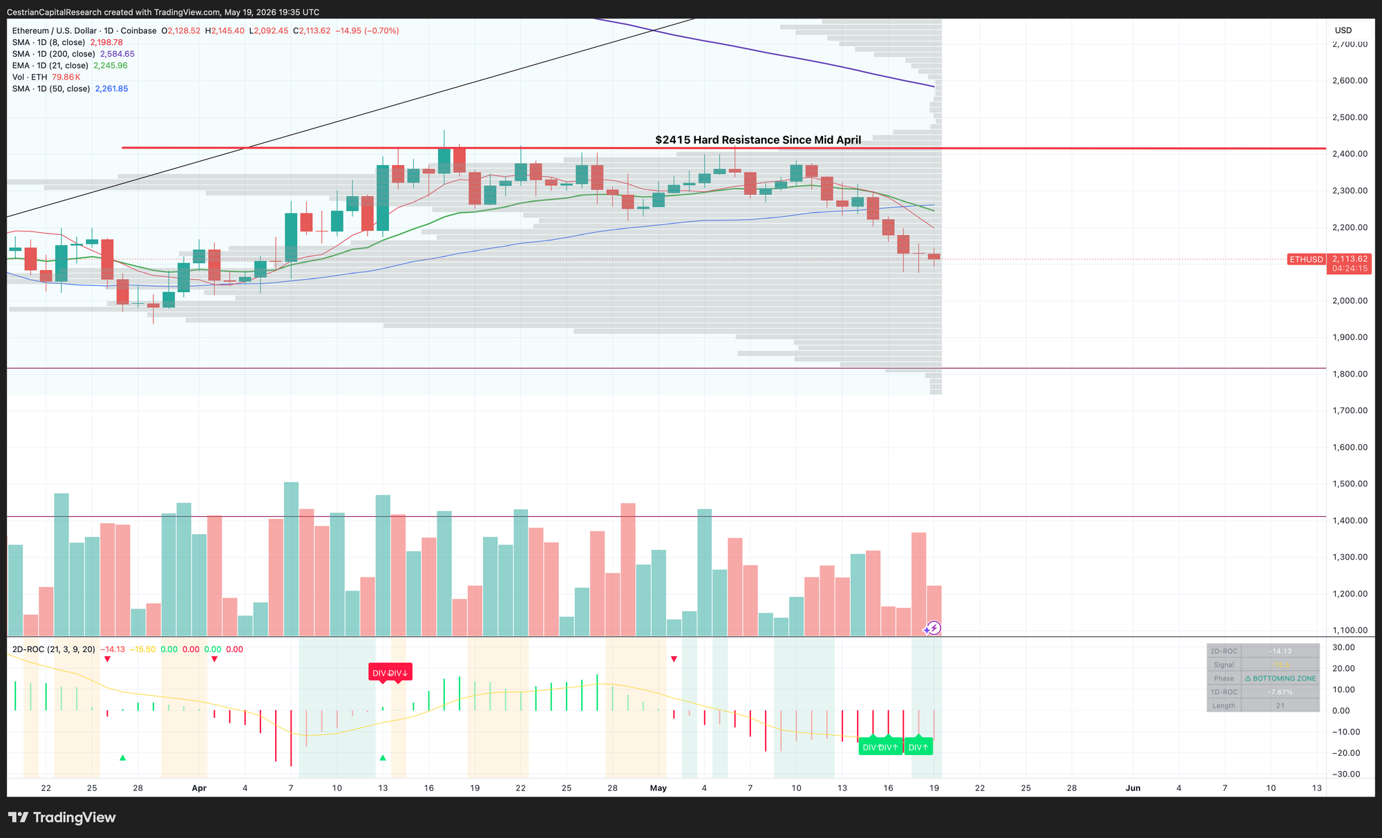
At present this indicator concludes that Ether is in a bottoming phase.
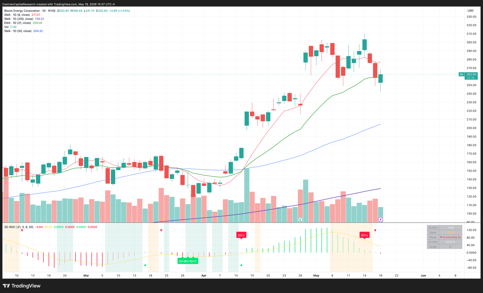
It also considers $BE to have put in at least a local top already.
I'm long both, by the way.
Concluding Remarks
The appeal of second-derivative analysis lies in its logic: markets rarely turn on a dime. Before a trend reverses, the energy behind it typically fades — buying or selling pressure decelerates before it disappears. Standard first-derivative indicators like MACD and RSI capture trend direction and relative strength well, but they are measuring the symptom rather than the underlying condition. The second derivative attempts to measure the condition itself.
For a long-only equity portfolio run with patience, the most practically useful application of this indicator is likely in the faded-red zone — identifying when a stock that has been under meaningful selling pressure is beginning to find equilibrium before the fundamental picture has changed enough to attract attention. This is precisely the lead time Druckenmiller alludes to: the chart sees the deceleration of bad news absorption before analysts revise estimates and before generalist investors return to the name.
For risk management purposes, the faded-green zone deserves equal attention. A portfolio position that has performed well and whose second-derivative ROC is rolling over — decelerating even as price remains near highs — is telling you something about the durability of the move. It may not be telling you to sell. But it is telling you to look harder.
We will continue to refine this indicator based on our own research and member feedback. Parameter optimization across specific sectors and market cap bands is a natural next step, and we are exploring whether adaptive lookback lengths — ones that adjust based on realized volatility — might improve signal quality. As always, we will publish our findings and update the tool accordingly.
Alex King, CEO, Cestrian Capital Research, Inc - 19 May 2026
Thanks for reading our free content. If you’d like an easy way to start your journey with Cestrian’s premium research, we’re currently offering a 30-day free trial to Cestrian Circle, our introductory tier. Click on the image below to sign up.